This past week I bit the bullet and took advantage of an offer through Go-Daddy to use one of their many hundreds of template styles to build my Website for the name domain I purchased last year. My son is a very good graphic designer and knows a lot about building websites however; he has been too busy to help put something together. I have had the name domain for almost a year and felt it was time to get something going that looked more professional for my art. After all, the link is available with several professional pastel society organizations and galleries, and did not look very good at all.
Building a website myself, now how hard could that be? I am not what you would call a techy or a computer geek. I have stayed active with computers since I retired and do know my way around a little. Just enough to get myself in trouble from time to time. Well Go-Daddy, show me what you've got! There are not idiot instructions for building a website, but there are enough drop dons on various pages that one can research a question and figure out how to use their product. I did run into several problems when I chose a ready made site, that one could change the printed words but changing the pictures was a lot more difficult.
I switched to a template style and color that I liked and started over. Fortunately it was fairly simple and I was able to make changes in the templates and upload photos and size them correctly to work on the various pages. My biggest challenge came when I decided to upload some of my art pictures. Getting the painting titles in and also the paintings was a huge issue and I ran into a few snags, and deleted it all deciding I would try that another day when I was fresh. The wait helped and I methodically worked out the way I wanted them to appear and managed with some setbacks to design the page the way I wanted. I would have liked to put borders around the pictures but that would take more knowledge than I have to know how to do that.
The template level that I chose only includes 5 pages for their $2.99 per month hosting charge for three years. If I was a more prosperous artist I would have elected to get a bigger package, but this is a good way to start out, and perhaps I can add to what I have started in the future. Yes, okay, I know I am cheap, but artist supplies are a more important concern right now. I also would have liked to change the name of one of the pages that says services, however the page names are locked in and not changeable from what I can figure out. I really do not need a page by this title, I would rather have had another gallery page. The last page is a contact sheet that allows interested persons to email me. I tested this feature and was pleased to see that it does work.
Now that I am finished and have uploaded my Website, please feel free to visit and let me know what you think of my it. You can find the site at http://www.paulmharman.com

This is my journey from day to day, some mundane and some fun. That is how life is and what we make of it. Hopefully you will have a beautiful sunrise day and enjoy it to the fullest.
Saturday, May 28, 2011
Wednesday, May 25, 2011
A Pastel Paper Review
I have been reading comments on Flickr of persons who are new to pastel painting and enjoying the medium very much. I have seen several very bad pieces of advice from novices who have said things like, "I just use computer paper and it works fine for me", or I just use a piece of clean cardboard." Some of these kinds of bad advice motivated me to do a short synopsis of pastel papers for people who have not tried them or cannot access them at their local art store. So below is a list of those I have tried, and my preferences and those I will not likely use again.
I will go ahead an number the different papers to keep them separated. They are not in any particular order:
I will go ahead an number the different papers to keep them separated. They are not in any particular order:
1. Ampersand pastel board - museum series panel - I bought several of these for plein aire work. They have a sanded surface hand applied with Kaolin clay ground textured with fine marble dust granules. My pastel mentor uses these a lot and likes them. I used one for a plein aire painting last month and found the surface to be quite fine. I did not like it nearly as much as the Colourfix Board, but it is okay. I will probably not buy any more, I prefer the Colourfix or the Rtistx boards.
2. Canson MI-Tientes - assorted colors a 98 lb paper that has a smooth side and a rough side. It is my least favorite, the smooth side, which I prefer does not take a lot of pastel, but is okay for quick in the field sketches. The rough side is difficult to cover the pattern in the paper unless of course you like to paint fast and loose, and use very soft pastels. Then it will probably be fine.
3. There are two types of Art Spectrum Colourfix pastel paper.
(a.) Art Spectrum, Colourfix sanded paper - Comes in 20 different colors. I like the texture, but the paper is not very heavy. It does take pastel quite well. It will more likely curl if it gets damp because of the light weight.
(b). Art Spectrum, Colourfix Plein Aire Painting Board - I purchased some 12" X 16" boards and really liked the surface. The Boards come in a selection of 17 colors including white. The cost was around $8.60 per board. It does come in larger sizes for example 14" X 18" boards. It takes pastel well, is heavy enough to use without a backing board and will drop in a frame if you want to. I painted my "Water, Life Blood of the Range" painting with this board. This one is first rate.
4. Sennelier "La Carte" pastel paper. This is an excellent paper and the tooth is made from a vegetable substance and takes pastel really well. I have used it a lot and really like it. The only warning I have is be extremely careful to never get it damp or try a water color wash on it, it will destroy the paper surface completely. This is an excellent paper for studio work, and for plein aire if there is no chance of rain!
5. Pastel Mat pastel paper - I found this to be a very smooth surface almost like a velour. It does not hold a lot of pastel and so I was disappointed with it and frustrated because I could not blend on this surface and get the effect without the tooth filling completely. It is not a paper I am likely to buy again. In fairness to those who love this surface I am glad you like it.
6. Richardson sanded pastel paper - I have just purchased three large sheets of 18 X 24 in three different colors, I believe there are seven choices of color. It has a more course surface than Colourfix paper, and the paper is a little heavier. I am painting a pastel with it now and while it takes multiple layers of pastel well, it is more difficult to do fine detail because of the coarse surface. For those of you who are not into detail, you will love it.
7. RTISTX 280- I purchased several of their boards which are heavy enough to use for plein aire work. I really liked the sanded surface which comes in Taupe or white. It is tough, heavier than the Colourfix Board , takes a lot of pastel, and will take water color washes, Turpenoid washes, oils, acrylic or charcoal. Do not use alcohol or acetone with this board, it will dissolve the tooth. The largest size it comes in is the 18" X 24" which I used for my Bald Eagle pastel. It is acid, lead and Barium free and 100% archival quality. The man who designed it is a roofer and a pastel artist who was not happy with the products on the market and decided to design his own. He is trying to get it marked with some of the larger suppliers. His product is a little pricey but very good quality and you can find RTISTX in a web search.
8. Wallis paper - I just received my order of several 8 pad books of this paper in 9" x 12" and 12" X 16" sizes after buying some larger 18" X 24" and 24" x 36" sheets of this linen based paper. It is strong, a rag based paper, heavier and will take water or turps washes if that is what you like to do before starting your drawing. This is a professional archival surface and comes in museum or professional grades. It is available in Belgian Mist or White. I am planning on using it for my next painting and it is already to go on my easel. I like the feel, and it seems to have a really good tooth. Many pastel artists I have spoken to with the Pastel Society of the West Coast love this paper the most of all they have tried. I have a similar response based on its texture. It does take a lot of pastel and one can blend on this paper. A word of caution though, if you blend with your fingers, it will take layers of skin off before you know it.
There are other papers out there, I have not yet tried. I would be interested in hearing from any other pastel artists who like other papers and why. Keep painting and share your tips to help other artists improve their art.
Saturday, May 21, 2011
A Fogggy Day on Lion Creek
 Cindy and I were out for a ride on this particular foggy day just exploring the area between Ojai and Santa Paula . We had just climbed over some hills shortly after leaving Ojai and were descending down the hill on the old Ojai to Santa Paula road when I saw a lovely oak covered swale that might be a good painting. I stopped the car to have a look and took a few pictures. I took a few different shots and noted the colors and the light and overcast sky with the fog creeping over the distant hills. I got back in the car and we continued down the road and drove over this lovely gorge, but could not stop because there was no safe place to pull over. I drove a little further and found a place wide enough to turn around and went back across the bridge and did a u-turn into a turnout just a short distance above the bridge and parked the car.
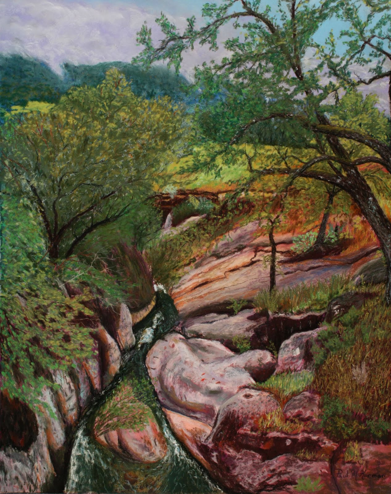
 Our navigation unit in the car indicated the gorge was Lion Creek. Lion Creek flows through a gorge that it has cut in the sandstone rock of the beautiful valley that it cuts through. Like many streams in southern California, it likely drys up in the summer, but during the rainy season it flows fast and furious carrying runoff all the way to the sea. Where the bridge crosses over the little gorge that Lion Creek has cut it is probably 20 feet deep.

I walked down the hill to the bridge and looked at the gorge from the bridge and was amazed at the rocks and trees, and color I saw. There were so many shades of green, ochre colored and rust red stained rocks, dark green water and some water worn granite boulders. I decided to climb down into the gorge and see what it looked like from below. My painter senses were on high awareness, and my eyes were filled with this beautiful scene I was seeing for the first time. My ears tuned into the sound of the water rushing through the rocks, tumbling and twisting over and around obstacles it had gradually worn down over many centuries of time. I could hear birds tweeting and talking to one another in the trees. I stood on a rocky sandstone outcrop above the stream and drank in the beauty of this place. The fog creeping over the distant hills, the stillness of the place, different songs of the many birds and the sound of rushing water. The oak trees and vines that dangled down the walls had fresh green leaves, broken here and there by dappled sun. Contrasting colors everywhere, and even emerald green grass on a sloping hill the stream had cut through. This scene spoke to me and cried out to be painted.
I made mental notes of the colors, the lighting, and took several pictures with my Canon camera so that I would have some good reference photos to use when I got back home. My easel was in the car, but there wasn't time nor a safe place to set up and paint right there.
A week and a half later I had cleared time to begin the painting of Lion Creek. I chose a 20" X 16" RTISTX board for the painting. I also decided that I would block in some basic undercolor areas using some of my Nupastels. I did a rough sketch of the scene on the board and then carefully laid down the undercolorss of blue where the mountains would go, green for some of the tree areas, brown for the ground under the trees and maroon for some of the rock undercolor. Once these colors were in place I brushed them with Turpenoid and allowed the colors to run a little. This was a new effort for me, I had wanted to try this technique on one of my pastels after watching a Richard McKinley DVD. I was very pleased with the result and it took about ten minutes for the Turpenoid to dry. I had a nice even color distribution over the areas and then began to apply the sky, clouds and some of the mountain detail with both Rembrandt and Winsor Newton pastels. Things moved along well in the early stages and I began working on the tree trunks and also the rocks lining the streambed.
The painting seemed extremely busy and detailed and as time went by and I moved further along I got to a point where I just seemed to block. This may surprise you since I am so much of a detail person in most of my paintings. I wasn't sure if I was going to be able to complete this painting and get it to look right and capture the wonderful scene I had viewed. My reference photos were good, but I was having difficulty getting the rocks to look realistic. They had such unusual roundness on some of them, they looked like someone had dumped a truck load of cement and smoothed it in humps and swirls, and then covered parts of it with vegetation. The bank on the one side was cut more sheer, and the vines trailed over it, so there was a lot going on there. I was also concerned that there was so much green from so much vegetation, I didn't want it to all blur into one color. I decided after getting to a certain point to just stop, and take a break from this painting, and start another completely different scene. I started another wine country painting, since I had been doing a series of them. I would periodically stop and just stare at my Lion Creek work and wonder if I would ever have the confidence to continue with it.
Taking a break and not forcing the painting was a good idea. One day while we were at lunch with some friends on the patio of Appleby's in Auburn, I had a break through. I was looking at the trees bordering the patio. I noticed the shadows on the branches, and the many shades of green I could see in the leaves from the sunlight. Just seeing the trees and the way the light played on them helped me to realize how I could continue the Lion Creek painting.
 |
| A Foggy Day on Lion Creek |
When we got home, I set my easel up outside on our back deck and brought my pastel box out and put it on a table. We have many trees that border our deck, and based on the light I saw on them, I knew I could separate the trees and their color values so that they could stand individually, and not all merge into one green mass. It was a beautiful day, comfortable temperatures and I was charged to dig into the painting. With the new found confidence I was able to complete the canopy of trees by separating the values of different trees. I was also able to work on the shading and colors in the rocks with better light. Being outside in good light was a much better alternative than my poorly lit studio environment. The light helped me to chose a sunlit color for the grass in the meado that bordered the stream so it enhanced the feeling of depth in the painting. Natural light is so important to help one get a good true color value balance.
The last piece I worked on was the water in the stream. Little light filtered through the tree canopy to play on the water. It was deep in shadow, and so I chose to keep it the dark green I had viewed on site, and just put some light blue sky highlights in the ripples and in the froth it kicked up going through sections with rocks under the surface. I was pleased when I got to the point where I could stand back and know that I had captured the little Lion Creek Gorge I enjoyed so much on that visit. I hope you enjoy too.
Subscribe to:
Posts (Atom)