This past week I bit the bullet and took advantage of an offer through Go-Daddy to use one of their many hundreds of template styles to build my Website for the name domain I purchased last year. My son is a very good graphic designer and knows a lot about building websites however; he has been too busy to help put something together. I have had the name domain for almost a year and felt it was time to get something going that looked more professional for my art. After all, the link is available with several professional pastel society organizations and galleries, and did not look very good at all.
Building a website myself, now how hard could that be? I am not what you would call a techy or a computer geek. I have stayed active with computers since I retired and do know my way around a little. Just enough to get myself in trouble from time to time. Well Go-Daddy, show me what you've got! There are not idiot instructions for building a website, but there are enough drop dons on various pages that one can research a question and figure out how to use their product. I did run into several problems when I chose a ready made site, that one could change the printed words but changing the pictures was a lot more difficult.
I switched to a template style and color that I liked and started over. Fortunately it was fairly simple and I was able to make changes in the templates and upload photos and size them correctly to work on the various pages. My biggest challenge came when I decided to upload some of my art pictures. Getting the painting titles in and also the paintings was a huge issue and I ran into a few snags, and deleted it all deciding I would try that another day when I was fresh. The wait helped and I methodically worked out the way I wanted them to appear and managed with some setbacks to design the page the way I wanted. I would have liked to put borders around the pictures but that would take more knowledge than I have to know how to do that.
The template level that I chose only includes 5 pages for their $2.99 per month hosting charge for three years. If I was a more prosperous artist I would have elected to get a bigger package, but this is a good way to start out, and perhaps I can add to what I have started in the future. Yes, okay, I know I am cheap, but artist supplies are a more important concern right now. I also would have liked to change the name of one of the pages that says services, however the page names are locked in and not changeable from what I can figure out. I really do not need a page by this title, I would rather have had another gallery page. The last page is a contact sheet that allows interested persons to email me. I tested this feature and was pleased to see that it does work.
Now that I am finished and have uploaded my Website, please feel free to visit and let me know what you think of my it. You can find the site at http://www.paulmharman.com

This is my journey from day to day, some mundane and some fun. That is how life is and what we make of it. Hopefully you will have a beautiful sunrise day and enjoy it to the fullest.
Saturday, May 28, 2011
Wednesday, May 25, 2011
A Pastel Paper Review
I have been reading comments on Flickr of persons who are new to pastel painting and enjoying the medium very much. I have seen several very bad pieces of advice from novices who have said things like, "I just use computer paper and it works fine for me", or I just use a piece of clean cardboard." Some of these kinds of bad advice motivated me to do a short synopsis of pastel papers for people who have not tried them or cannot access them at their local art store. So below is a list of those I have tried, and my preferences and those I will not likely use again.
I will go ahead an number the different papers to keep them separated. They are not in any particular order:
I will go ahead an number the different papers to keep them separated. They are not in any particular order:
1. Ampersand pastel board - museum series panel - I bought several of these for plein aire work. They have a sanded surface hand applied with Kaolin clay ground textured with fine marble dust granules. My pastel mentor uses these a lot and likes them. I used one for a plein aire painting last month and found the surface to be quite fine. I did not like it nearly as much as the Colourfix Board, but it is okay. I will probably not buy any more, I prefer the Colourfix or the Rtistx boards.
2. Canson MI-Tientes - assorted colors a 98 lb paper that has a smooth side and a rough side. It is my least favorite, the smooth side, which I prefer does not take a lot of pastel, but is okay for quick in the field sketches. The rough side is difficult to cover the pattern in the paper unless of course you like to paint fast and loose, and use very soft pastels. Then it will probably be fine.
3. There are two types of Art Spectrum Colourfix pastel paper.
(a.) Art Spectrum, Colourfix sanded paper - Comes in 20 different colors. I like the texture, but the paper is not very heavy. It does take pastel quite well. It will more likely curl if it gets damp because of the light weight.
(b). Art Spectrum, Colourfix Plein Aire Painting Board - I purchased some 12" X 16" boards and really liked the surface. The Boards come in a selection of 17 colors including white. The cost was around $8.60 per board. It does come in larger sizes for example 14" X 18" boards. It takes pastel well, is heavy enough to use without a backing board and will drop in a frame if you want to. I painted my "Water, Life Blood of the Range" painting with this board. This one is first rate.
4. Sennelier "La Carte" pastel paper. This is an excellent paper and the tooth is made from a vegetable substance and takes pastel really well. I have used it a lot and really like it. The only warning I have is be extremely careful to never get it damp or try a water color wash on it, it will destroy the paper surface completely. This is an excellent paper for studio work, and for plein aire if there is no chance of rain!
5. Pastel Mat pastel paper - I found this to be a very smooth surface almost like a velour. It does not hold a lot of pastel and so I was disappointed with it and frustrated because I could not blend on this surface and get the effect without the tooth filling completely. It is not a paper I am likely to buy again. In fairness to those who love this surface I am glad you like it.
6. Richardson sanded pastel paper - I have just purchased three large sheets of 18 X 24 in three different colors, I believe there are seven choices of color. It has a more course surface than Colourfix paper, and the paper is a little heavier. I am painting a pastel with it now and while it takes multiple layers of pastel well, it is more difficult to do fine detail because of the coarse surface. For those of you who are not into detail, you will love it.
7. RTISTX 280- I purchased several of their boards which are heavy enough to use for plein aire work. I really liked the sanded surface which comes in Taupe or white. It is tough, heavier than the Colourfix Board , takes a lot of pastel, and will take water color washes, Turpenoid washes, oils, acrylic or charcoal. Do not use alcohol or acetone with this board, it will dissolve the tooth. The largest size it comes in is the 18" X 24" which I used for my Bald Eagle pastel. It is acid, lead and Barium free and 100% archival quality. The man who designed it is a roofer and a pastel artist who was not happy with the products on the market and decided to design his own. He is trying to get it marked with some of the larger suppliers. His product is a little pricey but very good quality and you can find RTISTX in a web search.
8. Wallis paper - I just received my order of several 8 pad books of this paper in 9" x 12" and 12" X 16" sizes after buying some larger 18" X 24" and 24" x 36" sheets of this linen based paper. It is strong, a rag based paper, heavier and will take water or turps washes if that is what you like to do before starting your drawing. This is a professional archival surface and comes in museum or professional grades. It is available in Belgian Mist or White. I am planning on using it for my next painting and it is already to go on my easel. I like the feel, and it seems to have a really good tooth. Many pastel artists I have spoken to with the Pastel Society of the West Coast love this paper the most of all they have tried. I have a similar response based on its texture. It does take a lot of pastel and one can blend on this paper. A word of caution though, if you blend with your fingers, it will take layers of skin off before you know it.
There are other papers out there, I have not yet tried. I would be interested in hearing from any other pastel artists who like other papers and why. Keep painting and share your tips to help other artists improve their art.
Saturday, May 21, 2011
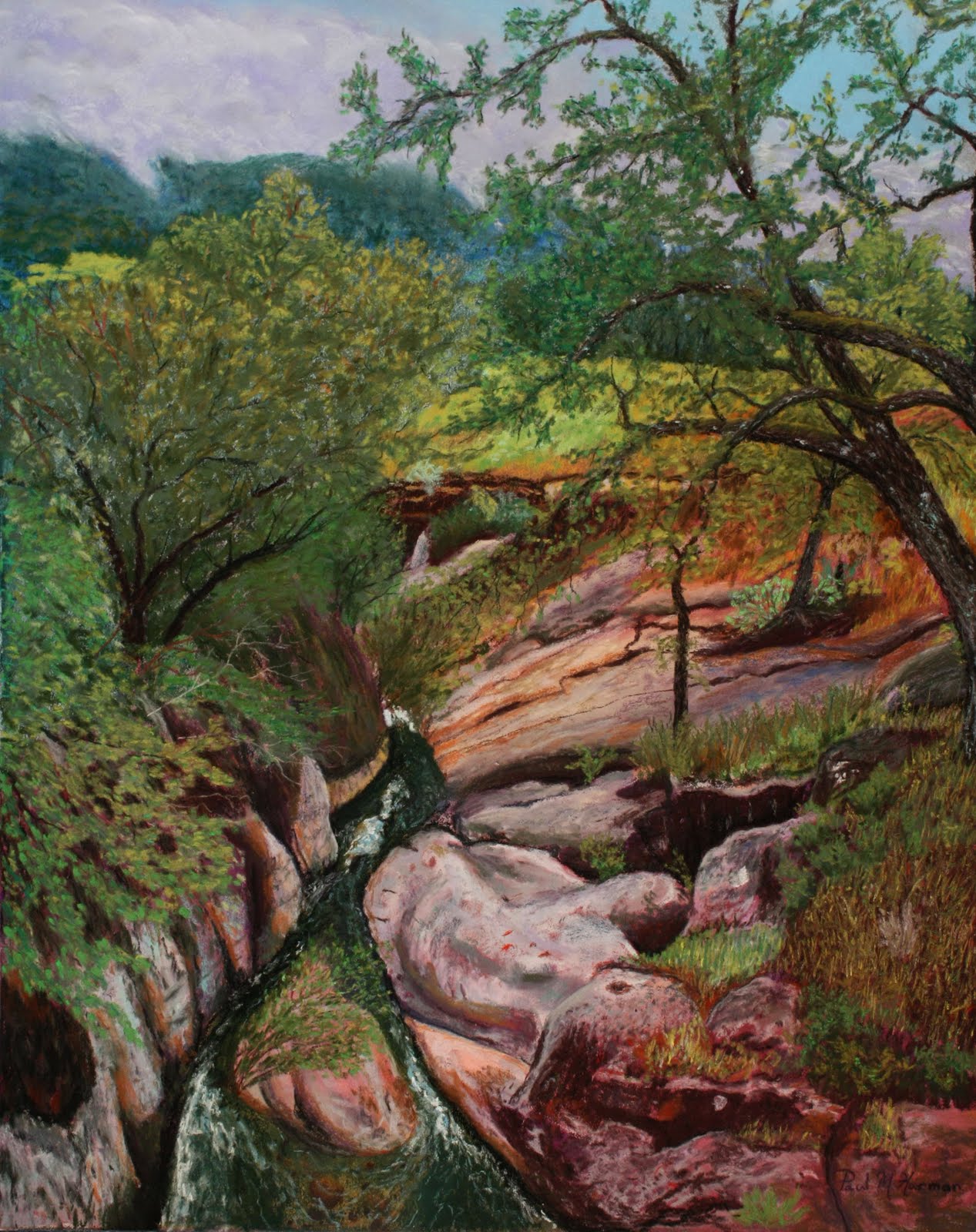
A Fogggy Day on Lion Creek
 Cindy and I were out for a ride on this particular foggy day just exploring the area between Ojai and Santa Paula . We had just climbed over some hills shortly after leaving Ojai and were descending down the hill on the old Ojai to Santa Paula road when I saw a lovely oak covered swale that might be a good painting. I stopped the car to have a look and took a few pictures. I took a few different shots and noted the colors and the light and overcast sky with the fog creeping over the distant hills. I got back in the car and we continued down the road and drove over this lovely gorge, but could not stop because there was no safe place to pull over. I drove a little further and found a place wide enough to turn around and went back across the bridge and did a u-turn into a turnout just a short distance above the bridge and parked the car.
 Our navigation unit in the car indicated the gorge was Lion Creek. Lion Creek flows through a gorge that it has cut in the sandstone rock of the beautiful valley that it cuts through. Like many streams in southern California, it likely drys up in the summer, but during the rainy season it flows fast and furious carrying runoff all the way to the sea. Where the bridge crosses over the little gorge that Lion Creek has cut it is probably 20 feet deep.

I walked down the hill to the bridge and looked at the gorge from the bridge and was amazed at the rocks and trees, and color I saw. There were so many shades of green, ochre colored and rust red stained rocks, dark green water and some water worn granite boulders. I decided to climb down into the gorge and see what it looked like from below. My painter senses were on high awareness, and my eyes were filled with this beautiful scene I was seeing for the first time. My ears tuned into the sound of the water rushing through the rocks, tumbling and twisting over and around obstacles it had gradually worn down over many centuries of time. I could hear birds tweeting and talking to one another in the trees. I stood on a rocky sandstone outcrop above the stream and drank in the beauty of this place. The fog creeping over the distant hills, the stillness of the place, different songs of the many birds and the sound of rushing water. The oak trees and vines that dangled down the walls had fresh green leaves, broken here and there by dappled sun. Contrasting colors everywhere, and even emerald green grass on a sloping hill the stream had cut through. This scene spoke to me and cried out to be painted.
I made mental notes of the colors, the lighting, and took several pictures with my Canon camera so that I would have some good reference photos to use when I got back home. My easel was in the car, but there wasn't time nor a safe place to set up and paint right there.
A week and a half later I had cleared time to begin the painting of Lion Creek. I chose a 20" X 16" RTISTX board for the painting. I also decided that I would block in some basic undercolor areas using some of my Nupastels. I did a rough sketch of the scene on the board and then carefully laid down the undercolorss of blue where the mountains would go, green for some of the tree areas, brown for the ground under the trees and maroon for some of the rock undercolor. Once these colors were in place I brushed them with Turpenoid and allowed the colors to run a little. This was a new effort for me, I had wanted to try this technique on one of my pastels after watching a Richard McKinley DVD. I was very pleased with the result and it took about ten minutes for the Turpenoid to dry. I had a nice even color distribution over the areas and then began to apply the sky, clouds and some of the mountain detail with both Rembrandt and Winsor Newton pastels. Things moved along well in the early stages and I began working on the tree trunks and also the rocks lining the streambed.
The painting seemed extremely busy and detailed and as time went by and I moved further along I got to a point where I just seemed to block. This may surprise you since I am so much of a detail person in most of my paintings. I wasn't sure if I was going to be able to complete this painting and get it to look right and capture the wonderful scene I had viewed. My reference photos were good, but I was having difficulty getting the rocks to look realistic. They had such unusual roundness on some of them, they looked like someone had dumped a truck load of cement and smoothed it in humps and swirls, and then covered parts of it with vegetation. The bank on the one side was cut more sheer, and the vines trailed over it, so there was a lot going on there. I was also concerned that there was so much green from so much vegetation, I didn't want it to all blur into one color. I decided after getting to a certain point to just stop, and take a break from this painting, and start another completely different scene. I started another wine country painting, since I had been doing a series of them. I would periodically stop and just stare at my Lion Creek work and wonder if I would ever have the confidence to continue with it.
Taking a break and not forcing the painting was a good idea. One day while we were at lunch with some friends on the patio of Appleby's in Auburn, I had a break through. I was looking at the trees bordering the patio. I noticed the shadows on the branches, and the many shades of green I could see in the leaves from the sunlight. Just seeing the trees and the way the light played on them helped me to realize how I could continue the Lion Creek painting.
 |
| A Foggy Day on Lion Creek |
When we got home, I set my easel up outside on our back deck and brought my pastel box out and put it on a table. We have many trees that border our deck, and based on the light I saw on them, I knew I could separate the trees and their color values so that they could stand individually, and not all merge into one green mass. It was a beautiful day, comfortable temperatures and I was charged to dig into the painting. With the new found confidence I was able to complete the canopy of trees by separating the values of different trees. I was also able to work on the shading and colors in the rocks with better light. Being outside in good light was a much better alternative than my poorly lit studio environment. The light helped me to chose a sunlit color for the grass in the meado that bordered the stream so it enhanced the feeling of depth in the painting. Natural light is so important to help one get a good true color value balance.
The last piece I worked on was the water in the stream. Little light filtered through the tree canopy to play on the water. It was deep in shadow, and so I chose to keep it the dark green I had viewed on site, and just put some light blue sky highlights in the ripples and in the froth it kicked up going through sections with rocks under the surface. I was pleased when I got to the point where I could stand back and know that I had captured the little Lion Creek Gorge I enjoyed so much on that visit. I hope you enjoy too.
Thursday, March 10, 2011
Another Milestone
I believe that the most difficult hurdle to overcome for a new artist is the challenge of breaking into the local art community and being accepted as an artist in one's own right. I addressed that challenge by joining my local arts group, Placer Arts and began attending functions. I also had a very supportive mentor /teacher Reif Erickson, who was pleased that I was following through with my art and going beyond the weekly classes and trying to create my own style. Besides being an excellent teacher and a wonderful pastel artist himself, he has become a good friend and encourager. He shares his suppliers, and has given me the names of places where I can reduce my costs to purchase art supplies. Becoming known locally in our own city or town, and having a venue to show paintings where friends, neighbors and others will see them is not easy because there are limited venues to show paintings publicly. There is no guidebook that tells one how to overcome all of the obstacles that one faces, but what I knew it would take was persistence.
I began checking with the local Old Town Gallery in old town Auburn. It is a beautiful gallery and member artists volunteer time to man the store, and pay rent for space to hang their art. This beautiful gallery is independent of the Placer Arts Group. Being new at this and working on a tight budget, paying a monthly rental was not something I could afford. I did decide to also join the Roseville Arts group at the Blue Line Gallery and paid my membership fee so that I would have access to enter gallery shows. I began exploring other venues as well like the Auburn Faith Hospital that has an Art Can Heal program, and they invite local artists to hang paintings in a hallway and rotate the art every month or so. I have not received any response as to how long that list is yet, but I suspect it has quite a waiting list I checked with several local restaurants that had artwork hanging on their walls, and was told that it is all managed by the Placer Arts Association. They schedule art programs and include art from local high schools, and select the artists that will participate in the monthly art walk program that starts in May and runs through September. I am scheduled to be in the August Art Walk.
 Find in a venue to show paintings though takes a lot more work. Tsuda Market, a landmark that had been operated in Old Town Auburn by the Tsuda family for over 80 years finally closed last year. This little grocery store had provided many local Japanese and American food products to local families in town. Once it closed however; the building had to be brought into compliance with earthquake safety building codes before a new business could occupy the premises. After many months of renovation a new Cafe also called Tsuda occupied the site and became very popular with its excellent sandwiches, salads and bakery products. When we were eating lunch there one day, I asked the owner if I could have an opportunity to display some of my paintings on the walls there. Very modern bright colored acrylic paintings occupied 2/3 of the available space already. Alexandra took my card and said, as a matter of fact, I am planning on clearing the area behind the coffee bar and moving some things around, and using that as a rotating space for artists. I'll have a look at your art and we can talk again. One thing led to another and their were very many events on their calendar, and another meeting just did not happen. I just figured that the owner thought that my art would be too conservative compared to the really modern paintings already in the eating area.
In the meantime, I was contacted by a local Chiropractic Doctor, Heather Perry through Placer Arts forward of her email. She asked me if I would be interested in hanging some of my paintings in her offices that had been recently remodeled. She said an artist that knew me had referred me and I replied I would definitely be interested, and would come by to look at the offices. I went by and met Dr Perry and could see that this would be a nice place to hang paintings. Her practice offered a number of healing services and my friend Jeanie said she had sold three paintings when hers had been on display there over a three month period. Dr Perry has scheduled me to hang my paintings there in April.
Last week I dropped by Tsuda's early in the morning to buy some bakery products to take home to have with coffee. After purchasing them I saw Alexandra meeting with a supplier and just waived as I walked by. She called out to me and said, "Paul wait!" I turned around and walked back and she said, "That wall over there by the coffee bar is all yours to decorate with your paintings whenever you are ready." I said, thank you, that would be great. Needless to say, I was quite taken aback by this sudden turn of events and bubbling with enthusiasm when I got back home to tell my wife.
I went back the next day and measured the wall space and Alexandra said that I had to use existing nails in the old brick, or use existing holes. Since it was a historical building and the wall was brick, I needed to make sure to be very careful even using what was there. We can even hang things from the support beam if necessary she said. It looked like it would be a significant challenge and I went home and grabbed some paper, and began figuring out an arrangement and also deciding what paintings to hang there. I also gathered what I thought would be the necessary tools to take with me. Since the weekend is a very busy time with lots of tourist traffic, I decided to wait until Monday to hang my paintings.
 Monday morning, I loaded up my car with my tools and paintings and set off for Tsuda's. I was excited and also a little concerned, not knowing what obstacles would confront me once I began. My luck was good for a parking space was available right in front of the Cafe. I carried in my paintings and tools, and asked one of the food staff if Alexandra was in today. She said, yes she is, but she just left on an errand. I told her I was going to hang my paintings on the wall above the coffee bar. She said, "Oh yes, Alexandra said you would be in, let me take some of the things down and get them out of the way."
There was only one lonely old large headed nail in the uneven brick wall, and it was off center. and midway up the wall. I decided to hang the larger painting I had brought on that nail, once I checked it to make sure it was secure. Then I began searching the wall for existing holes that I could put proper hooks in to hang my paintings. None looked very promising, so I had to get creative. The nails I had with the hooks were slim, so I could gently tap them into cracks in the mortar and eventually managed to get all of the paintings hung. I had to shorten some wires and extend others to at least balance the paintings as best I could. As I was cleaning up and packing up my things to leave Alexandra came back in the Cafe and said, "Oh wow, that looks great Paul!"
 I stopped in again yesterday to drop off some cards and Alexandra said, "Well I have to tell you, your paintings are a big hit. Everyone likes them, and every time someone asks about the one on the top right, I tell them it is sold already. I want that one! My brother wants the one with the old Chevy truck." That is great news, I said thank you for giving me the opportunity to hang them in your cafe.
I am so delighted to have this kind of visibility in a busy cafe in our old town section. It is a major tourist haunt, and very busy on weekends. Locals frequent the area during the week. It is also just across the street from the art gallery. I told Alexandra I would pay her a commission on any painting I sell and replace them as vacancies provide that opportunity. She said that is fine, that is what she does with the other artist. That is more reasonable than the forty percent that galleries charge, and I don't have to pay monthly rental on the space. This means I will have money from sales to buy more supplies to continue painting. Now that is a real milestone.
I began checking with the local Old Town Gallery in old town Auburn. It is a beautiful gallery and member artists volunteer time to man the store, and pay rent for space to hang their art. This beautiful gallery is independent of the Placer Arts Group. Being new at this and working on a tight budget, paying a monthly rental was not something I could afford. I did decide to also join the Roseville Arts group at the Blue Line Gallery and paid my membership fee so that I would have access to enter gallery shows. I began exploring other venues as well like the Auburn Faith Hospital that has an Art Can Heal program, and they invite local artists to hang paintings in a hallway and rotate the art every month or so. I have not received any response as to how long that list is yet, but I suspect it has quite a waiting list I checked with several local restaurants that had artwork hanging on their walls, and was told that it is all managed by the Placer Arts Association. They schedule art programs and include art from local high schools, and select the artists that will participate in the monthly art walk program that starts in May and runs through September. I am scheduled to be in the August Art Walk.
 Find in a venue to show paintings though takes a lot more work. Tsuda Market, a landmark that had been operated in Old Town Auburn by the Tsuda family for over 80 years finally closed last year. This little grocery store had provided many local Japanese and American food products to local families in town. Once it closed however; the building had to be brought into compliance with earthquake safety building codes before a new business could occupy the premises. After many months of renovation a new Cafe also called Tsuda occupied the site and became very popular with its excellent sandwiches, salads and bakery products. When we were eating lunch there one day, I asked the owner if I could have an opportunity to display some of my paintings on the walls there. Very modern bright colored acrylic paintings occupied 2/3 of the available space already. Alexandra took my card and said, as a matter of fact, I am planning on clearing the area behind the coffee bar and moving some things around, and using that as a rotating space for artists. I'll have a look at your art and we can talk again. One thing led to another and their were very many events on their calendar, and another meeting just did not happen. I just figured that the owner thought that my art would be too conservative compared to the really modern paintings already in the eating area.
In the meantime, I was contacted by a local Chiropractic Doctor, Heather Perry through Placer Arts forward of her email. She asked me if I would be interested in hanging some of my paintings in her offices that had been recently remodeled. She said an artist that knew me had referred me and I replied I would definitely be interested, and would come by to look at the offices. I went by and met Dr Perry and could see that this would be a nice place to hang paintings. Her practice offered a number of healing services and my friend Jeanie said she had sold three paintings when hers had been on display there over a three month period. Dr Perry has scheduled me to hang my paintings there in April.
Last week I dropped by Tsuda's early in the morning to buy some bakery products to take home to have with coffee. After purchasing them I saw Alexandra meeting with a supplier and just waived as I walked by. She called out to me and said, "Paul wait!" I turned around and walked back and she said, "That wall over there by the coffee bar is all yours to decorate with your paintings whenever you are ready." I said, thank you, that would be great. Needless to say, I was quite taken aback by this sudden turn of events and bubbling with enthusiasm when I got back home to tell my wife.
I went back the next day and measured the wall space and Alexandra said that I had to use existing nails in the old brick, or use existing holes. Since it was a historical building and the wall was brick, I needed to make sure to be very careful even using what was there. We can even hang things from the support beam if necessary she said. It looked like it would be a significant challenge and I went home and grabbed some paper, and began figuring out an arrangement and also deciding what paintings to hang there. I also gathered what I thought would be the necessary tools to take with me. Since the weekend is a very busy time with lots of tourist traffic, I decided to wait until Monday to hang my paintings.
 Monday morning, I loaded up my car with my tools and paintings and set off for Tsuda's. I was excited and also a little concerned, not knowing what obstacles would confront me once I began. My luck was good for a parking space was available right in front of the Cafe. I carried in my paintings and tools, and asked one of the food staff if Alexandra was in today. She said, yes she is, but she just left on an errand. I told her I was going to hang my paintings on the wall above the coffee bar. She said, "Oh yes, Alexandra said you would be in, let me take some of the things down and get them out of the way."
There was only one lonely old large headed nail in the uneven brick wall, and it was off center. and midway up the wall. I decided to hang the larger painting I had brought on that nail, once I checked it to make sure it was secure. Then I began searching the wall for existing holes that I could put proper hooks in to hang my paintings. None looked very promising, so I had to get creative. The nails I had with the hooks were slim, so I could gently tap them into cracks in the mortar and eventually managed to get all of the paintings hung. I had to shorten some wires and extend others to at least balance the paintings as best I could. As I was cleaning up and packing up my things to leave Alexandra came back in the Cafe and said, "Oh wow, that looks great Paul!"

I am so delighted to have this kind of visibility in a busy cafe in our old town section. It is a major tourist haunt, and very busy on weekends. Locals frequent the area during the week. It is also just across the street from the art gallery. I told Alexandra I would pay her a commission on any painting I sell and replace them as vacancies provide that opportunity. She said that is fine, that is what she does with the other artist. That is more reasonable than the forty percent that galleries charge, and I don't have to pay monthly rental on the space. This means I will have money from sales to buy more supplies to continue painting. Now that is a real milestone.
Tuesday, February 15, 2011
Last Night We Lost a Dear Friend
Rich and Sharlyn Goss have been good friends for almost nine years. We have attended the same church and been in small group together for six years. Several years ago Sharlyn a retired elementary school teacher got pretty sick and her doctor treated her for pneumonia. Unfortunately, after she failed to respond to treatments, it turned out to be far worse, and a diagnosis of very advanced lung cancer. The news was devastating, how could it be lung cancer, Sharlyn never smoked.
She and Rich cried but got over the initial shock and saw a very good encologist at Kaiser hospital. Sharlyn went through extensive chemotherapy and lost her hair. She was always upbeat and positive. She was always chipper, always more concerned about her friends than the battle she was fighting. Everyone who knows her and Rich, knew her strength came from above. She knew, no matter what, and when her time came, she would be home with Him. She was given eighteen months to live over two and a half years ago and she lived each day with a smile and a laugh. Getting as much visiting with friends and family in as she could cram into every day of every week.
She lived to see her second granddaughter born and both of her grand daughters were the joy that lit her face whenever they were around. I am sure that when she was a teacher for all those many years, she had the same joy in her face with her charges. She lived to share a big Thanksgiving dinner with friends and family, and she enjoyed another great Christmas with her grandchildren, and family.
Cindy and I went over to say goodbye to Sharlyn on Sunday afternoon. The Morhpine she was given allowed her to relax and breath the oxygen she was on and though it made her drowsy, she could still respond "I love you too" when we talked to her. We hugged Rich and spent some special moments with him before we left. Last night Rich called to let us know that Sharlyn had a peaceful passing while the pastor was visiting and praying with the family at her bedside. Those were words we didn't want to hear, but we know she is no longer gasping for breath, and she is whole again in heaven. Happy to be with her heavenly Father. Rest in peace dear friend, we know you have added to the joyful voices in heaven.
Tuesday, January 25, 2011
Getting Organized
One of the things I was determined to do after I became thoroughly besotted with pastel painting was to make sure that I got organized. I am into my third year painting now and while I do not have a huge number of paintings to catalog, I surprised myself as to the number I had painted when I began to take inventory. My first year in only a few months as I began my journey, I painted thirteen paintings. The second year when my interest began to build, and my desire to challenge myself outside the classes, I painted 51 paintings. If this year is anything like last year, it will be a similar number.
Thanks to a very organized pastel painter whom I respect tremendously I received a lot of insight and guidance from his new book. Richard McKinley has written an excellent book for pastel painters describing his techniques, how he sorts and organizes his pastels by colors and value, what paper he uses, how he uses washes, and how he catalogs his paintings. The book in case you are interested, is called "Pastel Pointers" and even has a DVD in the back to demonstrate some of Richards techniques. There are many more good chapters than the ones I listed, but you get the idea. Richard really shared every aspect of his art.
One of the chapters that really caught my interest was a chapter devoted to cataloging pastels, developing an artist bio sheet for use in shows, and also a sheet to affix to the back of framed pastels that gives their catalog number, title, the artists copyright signature and also a nice little bio about what he hopes to achieve with his paintings.
That chapter resonated with me, so I made the decision to get more organized and look more professional. I developed my own Bio that I can now use at a show, or future shows. I also made up my own log in Microsoft Excel, to list my paintings by their number in order of completion, whether they are a pastel or some other medium, the month painted, the year, the size, type of paper used, what size the framed piece is and whether they have been sold, given as a gift, or entered in a show. It took me a quite a few hours to create this log and then enter all of the data into it. However, I am now up to date and all of my paintings are cataloged. When I go to deliver my four entries into the Vistas show next month, each painting will be readily identified with my personal sheet on the back providing all of the necessary information to the gallery, or to a buyer. If a painting sells, I can indicate the name of the buyer in my log in case there is some reason I need to contact them in the future. If there was a worst case scenario and I had a fire that destroyed my inventory, I would have a complete record of everything lost.
Another wonderful aid to organization was a Christmas gift from my wife, a Degas pastel carrying case that has straps and will hold 196 whole pastel sticks, or three times that number broken in thirds. I have organized my pastels by color and value in this wonderful case and can close it up and take it with me if I want to go out and paint on a location somewhere. The pastels are packed individually in foam slots, and foam goes over them to keep them from moving when you are ready to close them up. The other nice addition was four separate extra pastel box inserts that fit into the pastel case and I can store a back-up inventory of every pastel I have acquired, so that when I run out of a color in my portable easel box, or my working easel and carrier , I know exactly what color to replace it with.
These little first steps will go a long way to helping me stay organized with my art. My next goal is to gradually reorganize my home studio so that everything in it is functional, useful and easy to find. One of my first goals is to build a new easel that will be so much more functional and practical than the old aluminum one I am using currently. I hope this behavior on my part motivates you to think about organizing your studio, inventory or reference library. If you have some great tips you use, or some other ideas, please share them. We all get better when we share our passion our techniques, and those little things that help make it all come together.
Wednesday, January 19, 2011
Painting an Evening Beyond Compare
I joined the Pastel Society of the West Coast (PSWC), a very prestigious and talented group of successful artists last August. Unfortunately, I joined just after the deadline and missed the opportunity to enter a painting in their summer show at our own Placer Arts Gallery on Lincoln Way in uptown Auburn. I was very impressed with the talent and quality of art that was displayed at the show. Some of the paintings in the show were quite large and very beautiful. The PSWC show is going to be in Stockton this year at the Haggin Museum. The call for entries has already gone out and the deadline is February 18th.
This show will be my first opportunity to enter paintings in the PSWC show and so I made a decision to paint Southwest paintings of various sizes for my entries. While one can submit three or five paintings in the show depending upon the fee of $40.00 or $55.00, each member will only have two maximum in the show. Since this is to be a juried show, and an important opportunity I thought three paintings of various sizes would be an excellent way to show my artistic ability. The jurors will examine the digital images we submit and select two from those submitted and notify members of their selection choices.
In my previous blog, I displayed the other two paintings I have painted for this show, and the pencil sketch of the third one, a scene of the Mittens in Monument Valley. As I mentioned, I visited Monument Valley in early June 1964 as a young man, with my younger brother and have been enthralled with the beauty and wonderful colors of the buttes in and around the Navajo Tribal Parklands ever since. The particular scene I have chosen to paint has thunderheads rolling across the valley above the Mittens. That first night we had pitched our camp at the campground and were treated to the rolling and crashing of thunder bouncing off the buttes and canyon walls surrounding us. At times we would be in the middle of a heavy rain shower that managed to soak everything down in a matter of minutes as the storm clouds swept overhead. The rain made the valley sparkle with bright color because it deepened the hues. The sun was hidden behind the canyons to the west, but its light was illuminating the clouds and beginning to make them turn shades of pink and lavender. My challenge was going to be to capture the magic of that incredible evening I had experienced.
 The Kitty Wallis paper I was using for the painting was the Belgian shade, almost the color of red violet so it is a help to have that shade. When pastel painters are painting a picture as in other mediums, it is necessary to put in some under darker colors first in some of the major areas of the painting, those will be overlain with medium and lighter colors as the painting progresses. Here is an example of the first stage of adding under colors of darker pastel to my painting.
  work on the sky and the clouds so that I could make sure that I could capture the intensity of the thunderstorms and also the beautiful soft tints that the clouds picked up from the setting sun. One of the very fortunate things for me with this painting is there were no visible shadows since the sun was hidden. The rain had made it so bright and colorful, even though the sun was going down. One could see for miles, and there was no haze to obscure the distant canyons or valleys. Getting the clouds right was going to take layering of colors, and also some blending. It took quite a while to get the right feel of the billowing cloud formations, and the various shades. Darker underneath where it was raining, lighter where the sun was highlighting them, and softer where the tints were reflected. Eventually I accomplished the right feel by adding the rain showers and then it was time to work on the buttes themselves.
The three buttes or Mittens in this painting are north of the old Trading Post established by Harry Goulding and his wife Mike in 1923. While it is called Monument Valley, it really isn’t a valley at all, it is a vast plain with large buttes and mesas that have been eroded over thousands of years by wind and water. It is a very dry area at the 5400 foot elevation with very few trees and a lot of the famous purple sage. Some of the land is rough, jumbled with rocks from collapsing buttes, but much of it is sandy soil with washes that cut it up by water seeking a lower elevation. The tough part was to make the buttes look much like they do with all of the layers and weathering, and also to portray the uneven and irregular landscape with all of its colors in a realistic way. There is not a lot of vegetation in this beautiful arid area because of sandy soil and low amount of rainfall.
I had done one version of the landscape under the Mittens with a purple area to the left because it seemed more shaded by the clouds, but it just did not look natural even though it was a very pretty contrast. I went over the purple with various shades and values of Burnt Sienna and Burnt Umber, and a little Quinacridone Magenta in Rembrandt and Winsor Newton pastels to get the right mix of color. The I spent several more days paying attention to various areas on the buttes and landscape to tweak it until I was satisfied.
 |
| An Evening Beyond Compare |
Subscribe to:
Posts (Atom)